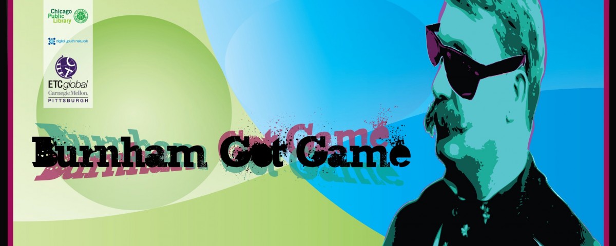
KLAD was tasked by the MacArthur Foundation, and the Entertainment Technology Center of Carnegie Mellon University with the design of a board game that would be used to teach the concepts behind the Burnham Master Plan for Chicago to school children. The Burnham Plan is an urban plan for the development of Chicago emanating from the downtown. It was created about 100 years ago, some of the ideas have been implemented over time, some of the concepts have evolved, and some of the plan is still expected to be executed.
There are lots of good things here for us as designers;
- We like urban planning
- We like maps
- We like Chicago beef
Daniel H. Burnham was an Architect and Planner. His firm designed and built some of the original skyscrapers and was pivotal in establishing the Chicago School of Architecture. In addition to this plan, Burnham also contributed to the plan that created the National Mall in DC, and designed the Flatiron Building in Manhattan. He was a pretty cool guy.
The idea for creating the Burnham Plan came from the City Beautiful Movement of the late 1800s and early 1900s. The City Beautiful Movement was a reform philosophy of architecture and planning that introduced beautification and monumental grandeur to cities. Beauty was promoted for its own sake, and to create moral and civic virtue among urban populations. Advocates believed that beautification would promote a harmonious social order. That would, of course, be their social order.
Those that disparaged the movement called it a cult. Some things never change.
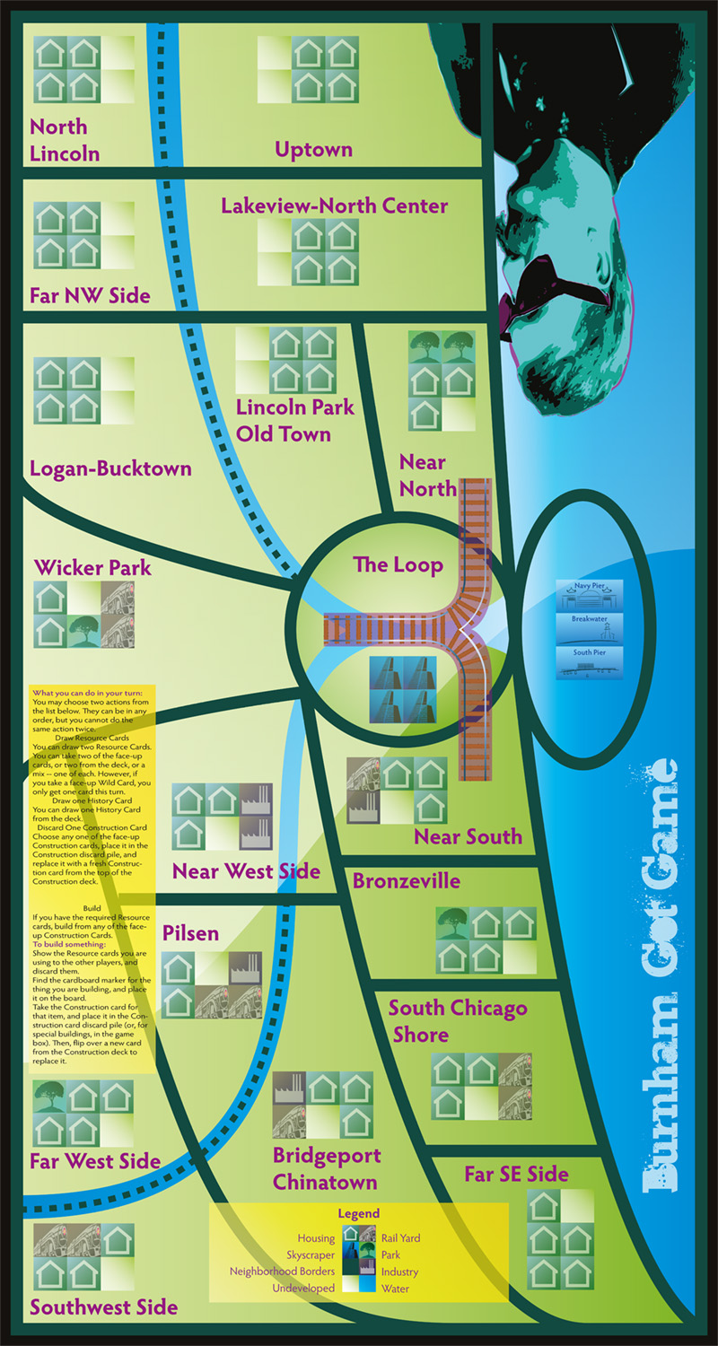
It was apparent that the game board would need to be a map of Chicago, and that the map would need to be stylized for game play. That led, of course, to researching maps, especially transit maps, another interest of mine. Even if we didn’t know how the game was to be played. There are many iconic maps, particularly of metropolitan transportation systems, of which, the London Underground map is probably the most iconic. The Chicago Transit Authority (CTA), like many other cities around the world, has a map that is clearly descended from the clean and abstract map of the London Underground. This seemed like a solid direction.
Maps are boring to many people, especially children. Even with loops. So, we gave it a contemporary, for that moment in time, twist; the Web 2.0 look; lots of highlights, shadows, and gradients. And lots of playing cards. Somewhat old school a few years later, but still more contemporary than a 1908 appearance. It was engaging and successful.
